
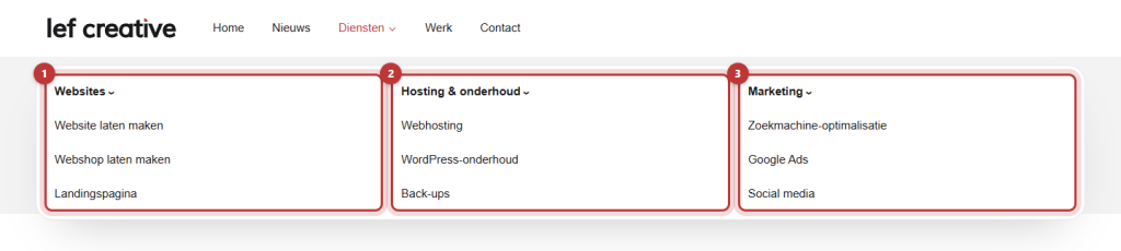
If you have many pages under one menu item, such as all your services, a regular dropdown menu can become long and confusing. A mega menu expands wide and arranges the links in columns with a header above. You create it in three steps.
In short
- Build three levels in your menu: main item, column headers, and links.
- Open the main item and turn Activate mega menu on.
- Each item at the second level becomes a column with a bold header.
- On mobile, the mega menu is a regular dropdown menu.
How does a mega menu work?
A mega menu is a dropdown menu that spans the full width of the header. It works with the regular menu structure in Menus:
- Level 1: the item in the menu bar, for example, ‘Services’.
- Level 2: each item becomes a column. The text is the bold header of the column.
- Level 3: the links under that header.
Nog geen website op leflite?
Wij bouwen hem samen met jou. Daarna pas je alles zelf aan, precies zoals in dit artikel.
- Online binnen een week
- Hosting, SSL en back-ups inbegrepen
- Vanaf €49,95 per maand
Step 1: Build the structure in three levels
Go to Menus and open your main menu. First, add the column headers as subitems under the main item. Below that, add the links, indented one step further to the right. You can read how to drag and indent in adjusting the main menu.
A column header does not need to be a real page. Use a Custom link with the URL # if the header does not need to link anywhere.
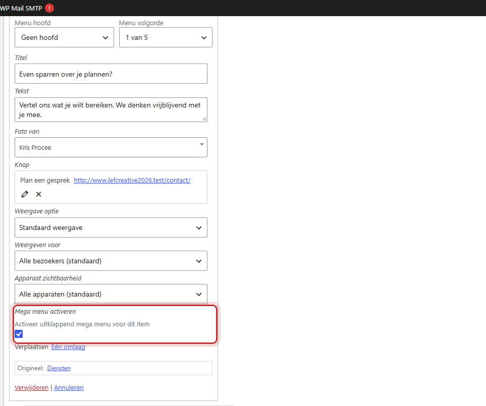
Step 2: Turn on Activate mega menu for the main item
Open the main item (level 1) with the arrow on the right. Turn Activate mega menu on. The explanation is: ‘Activate dropdown mega menu for this item’.
You will only see this option for menus located at Primary menu (or Primary menu 1 and 2) and Sub menu. In the mobile menu, the top bar, or the footer, there is no mega menu.
Step 3: Save and view the result
Click on Save menu. Hover over the main item on your website with the mouse. The mega menu expands across the width of the header.
How many columns?
There is no setting for the number of columns or their width. Each item at level 2 becomes a column, and the columns divide the space. Three or four columns are the most comfortable to read. If you need more, combine groups. Images, descriptions, or a button in the mega menu cannot be adjusted via the settings. That is custom work: contact us.
On mobile
The mobile menu is a separate menu, with regular dropdown menus. If you want the same layout on mobile, build the same levels in the mobile menu. On mobile, each level opens with the button with the arrow. See setting the menu on mobile.
Tip: using two menus in the menu bar? Then each main menu can have its own mega menu. Read how to organize the menu bar.
Having trouble?
- You do not see the option to activate the mega menu. The menu is not located at Primary menu or Sub menu. Check the location in Menu settings.
- You see a regular dropdown menu. The option is turned on for a column header instead of the main item, or you have not saved.
- The columns do not have links underneath. The links are at level 2 instead of level 3. Indent them one more step further.
- The mega menu is not on your phone. On mobile, you see the mobile menu. Build the same structure there.
- Can’t figure it out? contact us.
Share this article

Robert Oosterloo
Robert Oosterloo is eigenaar en UX/UI-designer van Lef Creative in Kollum. Hij ontwerpt websites, webshops en software voor ondernemers in Noord-Nederland.
Read also
Create a subpage
An anchor link to a section
A search function on your website






Want a website like this?
Here you can read how easy it is to maintain a leflite site yourself. Want one too? We will think along with you, no strings attached.
Prefer direct contact? Call Robert at 06 35 66 47 73 or send a WhatsApp.