
How do I set up the menu on mobile?

Robert Oosterloo
Updated on · 4 min read
On a phone, there is no space for your main menu. Your website then shows a hamburger button, which opens a separate menu: the Mobile menu. In this article, you will learn how to fill that menu and what else you can set up.
In short
- Up to 991 pixels wide, you will see the hamburger button. This opens the menu at the location Mobile menu.
- Always link a menu to that location. Otherwise, the mobile menu will be empty.
- Top bar, bottom bar, and a search field in the menu bar are not visible on mobile. Therefore, place important links in the mobile menu.
- With Keep menu visible on mobile, the main menu itself remains visible.
How does the menu work on mobile?
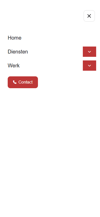
On screens up to 991 pixels wide (phones and most tablets), a hamburger button appears on the right side of the header. When you tap it, a white screen slides in from the left with the mobile menu and a close button. Items with a submenu have a button with an arrow. This allows you to expand the submenu.
The mobile menu is a separate menu. Changes in your main menu do not automatically appear there. This way, you can also consciously display a shorter menu on mobile.
Nog geen website op leflite?
Wij bouwen hem samen met jou. Daarna pas je alles zelf aan, precies zoals in dit artikel.
- Online binnen een week
- Hosting, SSL en back-ups inbegrepen
- Vanaf €49,95 per maand
Step 1: Create or open the mobile menu
Go to Menus. At the top of the menu, choose mobile, or click create a new menu, give it a Menu name like ‘Mobile menu’ and click Create menu. Add the pages as you do in the main menu: see adjust the main menu.
Step 2: Link it to the location Mobile menu
At the bottom under Menu settings, check the box for Mobile menu and click Save menu. If you want the same menu on mobile as on desktop, you can also link the main menu to this location. Then you only have one menu to maintain.

What do you not see on mobile?
A few components of the header are hidden on screens up to 991 pixels:
- the top bar above the menu;
- the bottom bar (Under menu);
- a shortcode in the menu bar, such as a search field (Menu bar shortcode).
If there is something important there, such as your phone number, a search function, or a button, include it in the mobile menu as well.
Phone number, search, or a button in the mobile menu
- Phone number: add a Custom link with the URL
tel:followed by your number, for exampletel:+31612345678, and type the number as link text. - Search: add the Search item. This provides a magnifying glass that links to the search page. See a search function on your website.
- Button: expand the item and choose Display option for Button. See a button or icon in the menu.
Show the main menu on mobile anyway
If you have a short main menu, for example two links, you can keep it next to the logo on mobile. Open the main menu in Menus and turn Keep menu visible on mobile on. This option is only visible for menus at the location Primary menu (or Primary menu 1 and 2). Then check on your phone if everything fits next to the logo.

Tip: always test the mobile menu on your own phone. Why this is important, you can read in why a responsive website is important.
Not working?
- The mobile menu is empty. There is no menu linked to the location Mobile menu. Link one and click Save menu.
- A new page is in the main menu, but not on mobile. The mobile menu is a separate menu. Add the page there as well.
- A submenu does not open when you tap the item. Tap the button with the arrow next to the item.
- Your phone number from the top bar is gone on mobile. The top bar is hidden on mobile. Place the number as a link in the mobile menu.
- The main menu does not fit next to the logo. Turn Keep menu visible on mobile off again.
- Can’t figure it out? contact us.
Frequently asked questions
There is no menu linked to the location Mobile menu. Link one in Menus, under Menu settings.
Share this article
Robert Oosterloo
Robert Oosterloo is eigenaar en UX/UI-designer van Lef Creative in Kollum. Hij ontwerpt websites, webshops en software voor ondernemers in Noord-Nederland.
Read also
Create a subpage
An anchor link to a section
A search function on your website





Want a website like this?
Here you can read how easy it is to maintain a leflite site yourself. Want one too? We will think along with you, no strings attached.
Prefer direct contact? Call Robert at 06 35 66 47 73 or send a WhatsApp.