
Responsive
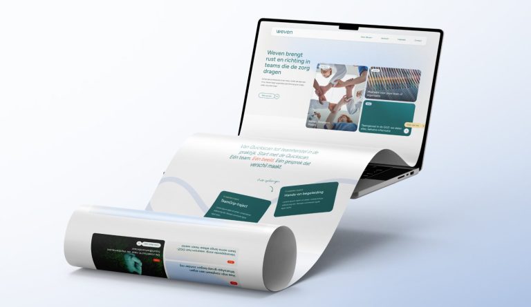


Your site looks great on any screen, from phone to widescreen.
3 articles about Responsive
Height, space, and width of a section
Minimum height, padding above and below (also separately for mobile), and a container full width.
Sections and columns on mobile
Keep columns side by side on mobile, and show sections or columns only on mobile or desktop.
How do I set up the menu on mobile?
Filling the mobile menu, adding important links, and showing the main menu on mobile.






No website with Lef yet?
This knowledge base is for everyone with a leflite website. Don’t have one yet? Schedule a conversation, no strings attached, and we will look at what you need together.
Prefer direct contact? Call Robert at 06 35 66 47 73 or send a WhatsApp.