
How do I control what happens to my sections and columns on mobile?

Robert Oosterloo
Updated on · 4 min read
On a phone, there is little space. Therefore, your website automatically stacks columns on top of each other. Usually, this is just right. If you want it differently, you can keep columns side by side, or show a section or column only on mobile or only on desktop.
In short
- Up to 991 pixels wide, columns are stacked by default.
- With Columns on mobile and tablet, you can keep them side by side.
- With Visibility, you can show a section or column only on desktop or only on mobile.
- Always check your page on a real phone.
What happens by default?
On screens up to 991 pixels wide (phones and most tablets), each column is 100% wide. They are stacked in the same order: the left column first. If you place text on the left and a photo on the right, then on mobile, the text will appear first, followed by the photo. Why this is important, you can read in why a responsive website is important.
Keeping columns side by side
Sometimes you want columns to be side by side on a smaller screen as well, for example, two small icons with a short text or a row of logos.
- Select the section.
- Open Alignment settings.
- Choose one of the options below for Columns on mobile and tablet.
The columns will then maintain the same ratio as on desktop: a column of 8 and one of 4 will remain 8 and 4.
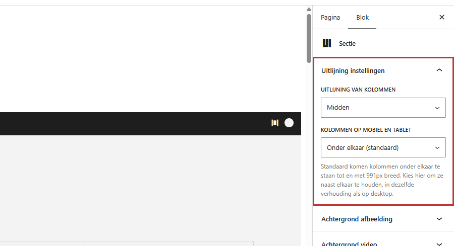
Stacked (default)
As described above.
Side by side from tablet (768px)
On a tablet and larger, the columns remain side by side; on a phone, they stack. A good middle ground for example two columns of text.
Always side by side, even on mobile
The columns are side by side on every screen. Use this only for short content: a long text in half the phone width is not easy to read.
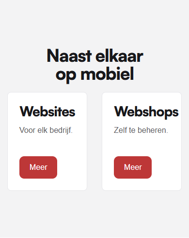
Note: this setting only applies to the columns directly in the section. Columns in a Row within a column will always stack on mobile.
Nog geen website op leflite?
Wij bouwen hem samen met jou. Daarna pas je alles zelf aan, precies zoals in dit artikel.
- Online binnen een week
- Hosting, SSL en back-ups inbegrepen
- Vanaf €49,95 per maand
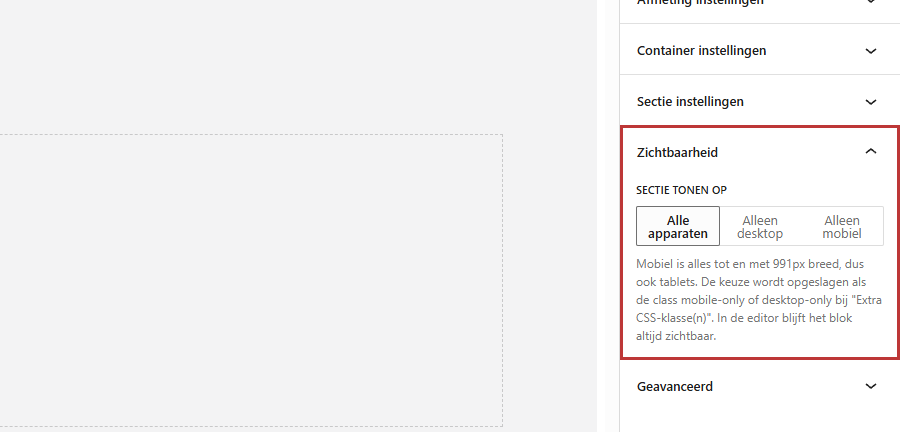
Hide a section or column on mobile or desktop
Select the section or column and open the Visibility panel. Choose at Show section on (or Show column on):
- All devices: the default.
- Desktop only: hidden on screens up to 991 pixels.
- Mobile only: only visible up to 991 pixels, so on phones and most tablets.
In the editor, everything remains visible so you can continue editing. In the editor, a small icon of a phone or computer will appear next to the section or column.
Example: a different hero on mobile
Your top section has a wide photo with text next to it on desktop, but on a phone, the photo looks messy. Then create two sections: set the first to Desktop only, copy it, and set the copy to Mobile only. In the mobile version, adjust the photo, the order, or the text. This way, you can also reverse the order of text and photo on mobile.
Hidden content is still loaded, just not displayed. So do not use this for heavy videos or many large photos. For a background video, there is a separate setting; see a video as a background.
Check your page on mobile
- Open the page on your own phone after saving.
- Or narrow the browser window on your computer. Note: the space above and below a section that you set separately for mobile will only be visible on a real phone (see height and space of a section).
Is it not working?
- A section is also missing on desktop: check under Visibility if it is set to Mobile only.
- Columns are still stacked on your tablet: choose Side by side from tablet (768px); keep your tablet horizontal if necessary.
- Columns in a row still stack: that cannot be changed. Place them directly in their own section.
- Your columns are too narrow on mobile: choose for that section again Stacked (default).
- More about columns: dividing a section into columns and everything about pages and sections.
Frequently asked questions
Not with a setting. Use two sections: one only for desktop and one only for mobile, with the columns in the order you want.
Share this article
Robert Oosterloo
Robert Oosterloo is eigenaar en UX/UI-designer van Lef Creative in Kollum. Hij ontwerpt websites, webshops en software voor ondernemers in Noord-Nederland.
Read also
More space between blocks
Tabs with Section tabs
Automatically display subpages as tiles






Want a website like this?
Here you can read how easy it is to maintain a leflite site yourself. Want one too? We will think along with you, no strings attached.
Prefer direct contact? Call Robert at 06 35 66 47 73 or send a WhatsApp.