
How do I add a section and divide it into columns?

Robert Oosterloo
Updated on · 5 min read
Do you want to add a new piece to your page, for example, text on the left and a photo on the right? Then you start with a section and divide it into columns. In this article, you will do this step by step and learn to work with the 12-grid system.
In short
- Click at the bottom of the editor on + Add Section.
- Choose under Choose a column layout a layout, such as 50 / 50.
- Adjust the width of a column with Column Width (1 to 12).
- Place blocks in a column with the + in that column.
Nog geen website op leflite?
Wij bouwen hem samen met jou. Daarna pas je alles zelf aan, precies zoals in dit artikel.
- Online binnen een week
- Hosting, SSL en back-ups inbegrepen
- Vanaf €49,95 per maand

What do you need?
- A page that is open in the editor. You can read about creating a new page in adding a new page.
- Not sure what a section and a column are? Then first read everything about pages, sections, and columns.
Step 1: Click on + Add Section
Scroll to the bottom of your page in the editor. The button + Add Section is always there. Click on it: a new, empty section will appear at the bottom of your page. Does it need to be somewhere else? Move it later with the arrows in the block toolbar (see moving or copying a block).
Next to this button is + Add Pattern. This allows you to place a ready-made section from your Builders.
Step 2: Choose a column layout
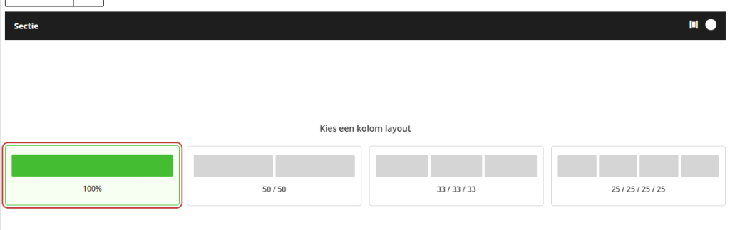
In the empty section, you will see Choose a column layout with four layouts:
- 100%: one column across the full width.
- 50 / 50: two equally wide columns.
- 33 / 33 / 33: three columns.
- 25 / 25 / 25 / 25: four columns.
Click on a layout. The columns will appear in the section.
Step 3: Adjust the column width
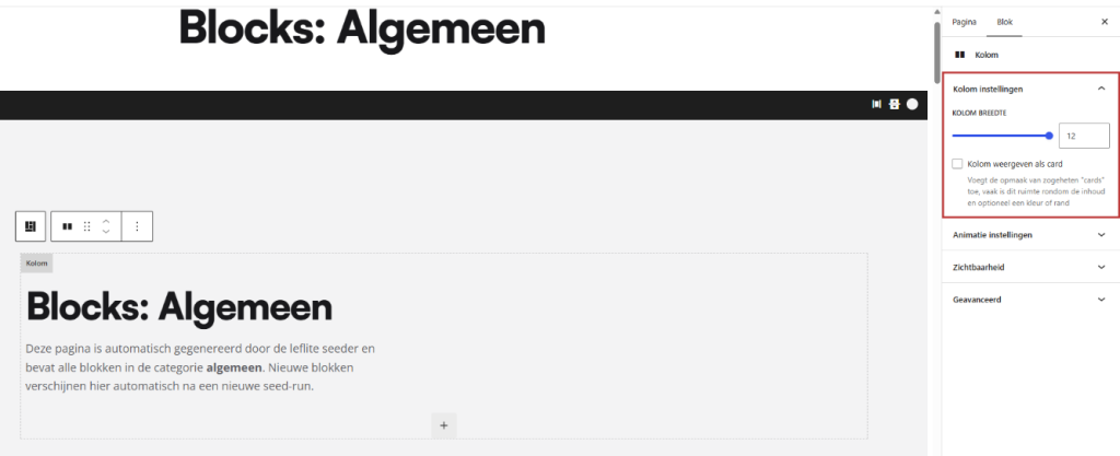
Click in a column (next to the content, not on a block) or select it in the list view. On the right in the sidebar, you will find the panel Column Settings with the slider Column Width. You choose a number from 1 to 12.
Calculating with 12
A section is 12 parts wide. The widths of the columns add up to 12:
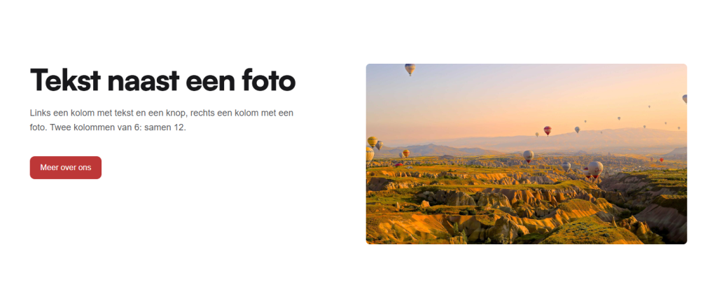
- 6 + 6: two equal halves.
- 4 + 4 + 4: three equal columns.
- 8 + 4: a wide text column with a narrow column next to it (approximately 70 / 30).
- 3 + 3 + 3 + 3: four columns.
- 12: one column across the full width.
If you total above 12, the next column starts on a new line. This is useful: a column of 12 with a title, followed by three columns of 4, gives a header with three tiles underneath in one section.
Step 4: Add a column
Do you need one more column? Select the section and click on + Add Column below the last column. The new column will automatically take the remaining space. If the row is already full, it will go on a new line and you can adjust the widths afterwards.
Step 5: Place blocks in the column
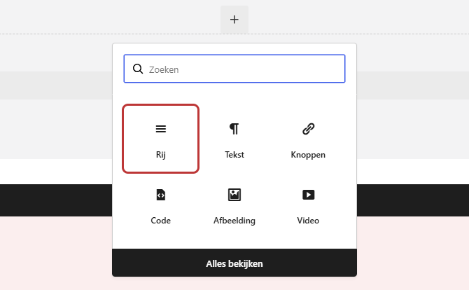
Click on the + in an empty column and choose a block, for example Text, Buttons, or Image. You can place multiple blocks one below the other in the same column. You can read more about blocks in adding a block to your page.
Columns within a column: the row
Sometimes you want to create a division within one column. For example: a wide column on the left with a title and two small blocks next to each other below it. Then add the block Row in that column. A row works like a mini-section: it will contain columns that together are 12 wide.
You can go one level deep: in a column that is already in a row, you cannot place a new row. Columns in a row will always stack on mobile.
Need more space between columns? Use an empty column
The space between columns is always equal, and you cannot set it per section. If you want more space between text and photo, leave a narrow column empty. For example, 5 + 1 + 6: text, an empty column, and a photo. Set the empty column to Visibility to Desktop only, so it won’t add extra white space on mobile.
Tip: do the columns not seem to align properly? Check if the widths add up to 12, and look at the section under Alignment Settings to see how they are aligned. See aligning columns and making them equal height.
Having trouble?
- You do not see the + Add Section button: scroll all the way down in the editor. If you are working in a Builder, it will also be at the bottom there.
- The column choice does not appear: you only see it in an empty section. If the section already has columns, add one with + Add Column.
- A column is below the other instead of next to it: the widths together are more than 12. Make one column narrower.
- On your phone, the columns are stacked: that is how it should be. If you want to keep them side by side, read columns on mobile.
- You cannot place a block directly in the section: that’s correct, a block is always in a column. First, choose a column layout.
Frequently Asked Questions
Not exactly: the grid is 12 wide. For example, use 4 columns of 3, or 6 columns of 2 in two sections.
Share this article
Robert Oosterloo
Robert Oosterloo is eigenaar en UX/UI-designer van Lef Creative in Kollum. Hij ontwerpt websites, webshops en software voor ondernemers in Noord-Nederland.
Read also
More space between blocks
Tabs with Section tabs
Automatically display subpages as tiles






Want a website like this?
Here you can read how easy it is to maintain a leflite site yourself. Want one too? We will think along with you, no strings attached.
Prefer direct contact? Call Robert at 06 35 66 47 73 or send a WhatsApp.