
How do I adjust the height, space, and width of a section?

Robert Oosterloo
Updated on · 4 min read
A hero that nearly fills the entire screen, less white space above a section or photos to the edge of the screen: you set this per section. In this article, you will read about the available settings and when to use them. Usually, the standard space from your style guide is the best choice.
In short
- Height and space are set for the section in the panel Size settings.
- Setting minimum height makes a section at least this high, in pixels or as a percentage of the screen (vh).
- Setting padding changes the space above and below, also separately for mobile.
- Container full width allows the content to extend to the edge of the screen.
Set Minimum Height
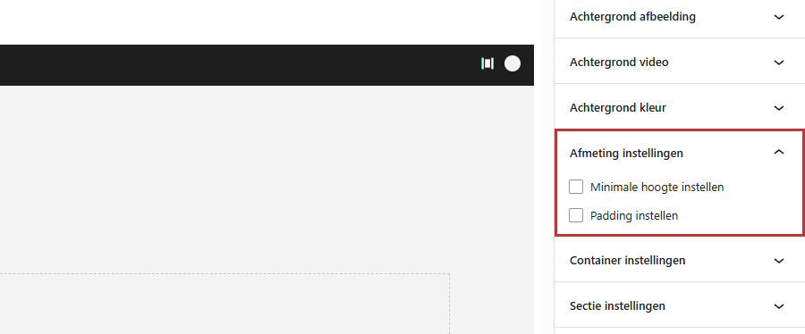
- Select the section and open the panel on the right Size Settings.
- Check Set Minimum Height.
- Choose Height Unit as Pixels (px) or View Height (vh).
- Use the slider Minimum Height to set the height: up to 1500 pixels, up to 100 vh.
It is a minimum height: if the content does not fit, the section will automatically become taller.
Pixels or View Height (vh)
With pixels, the section is the same height on every screen, for example, 600 px. With vh, the section adjusts based on the screen height: 100 vh is the entire screen, 85 vh is 85% of it. For a hero section at the top of your page, 70 to 85 vh often works well: the visitor can still see that more content is coming.
Text at the bottom or in the middle
In a tall section, you determine with Alignment Settings → Column Alignment where your text is positioned: Top, Middle, or Bottom. See aligning columns. With a photo behind it, you can read more in a photo as a background.
Nog geen website op leflite?
Wij bouwen hem samen met jou. Daarna pas je alles zelf aan, precies zoals in dit artikel.
- Online binnen een week
- Hosting, SSL en back-ups inbegrepen
- Vanaf €49,95 per maand
Padding: the space above and below
Each section has the same standard space above and below, from your style guide. This keeps your entire site looking calm and uniform. If you want more or less space for one section:
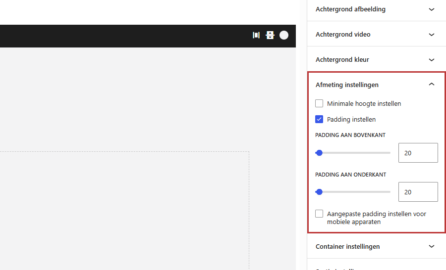
- Check the box in Size settings for Set padding.
- Set Padding at the top and Padding at the bottom, from 0 to 400 pixels.
If you do not adjust one of the two, that side will keep the standard space. If you really want 0, slide it down to 0.
Different padding on mobile
On a phone, a lot of white space can quickly feel empty. Check Set custom padding for mobile devices and set Padding at the top on mobile devices and Padding at the bottom on mobile devices
.
Note: this applies to the type of device. Your website checks whether a visitor is using a phone or tablet, not how wide the window is. If you make the window narrower on your computer, you will still see the regular padding. So check the mobile padding on your phone.
Container full width
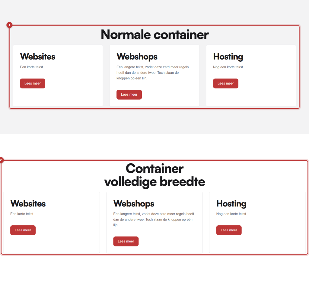
The content of a section is normally in a container: a box with a maximum width in the center of the screen (default 1300 pixels). On a wide screen, there will be space left and right. The background of the section always extends to the edge.
If you want the columns to also extend to the edge of the screen, for example, for a row of photos? Open the panel Container settings and check Container full width. There is no other width, such as a narrower container for long text. For that, you use a narrower column, for example, 8 wide with empty columns of 2 next to it.
When do you not change anything?
Usually. The standard space ensures that all sections on your site are evenly spaced. Only adjust the padding if there is a reason to do so, for example:
- a section that needs to connect directly to the previous one (padding at the top set to 0);
- two sections with the same color stacked, causing the space to double (see choosing a background color);
- a short section with just a button.
Do you want more space between two blocks within a column? That is not padding from the section: use the block Horizontal spacing. See spacing between blocks.
Having trouble?
- The padding is not changing: is Set padding checked, and did you really move the slider? A value that you do not touch is not saved.
- On your phone, you see the regular padding: do you also have Set custom padding for mobile devices checked? Refresh the page on your phone.
- The section is taller than you set: the content does not fit. Less text, or a smaller minimum height.
- There is extra space at the top of your page: with a fixed header, the first section gets extra space so that your text does not disappear behind the menu. That is intentional.
- Columns appear differently on mobile than you want: see columns on mobile.
Frequently Asked Questions
View Height: 100 vh is the height of the screen. 85 vh is therefore 85% of the screen.
Share this article
Robert Oosterloo
Robert Oosterloo is eigenaar en UX/UI-designer van Lef Creative in Kollum. Hij ontwerpt websites, webshops en software voor ondernemers in Noord-Nederland.
Read also
More space between blocks
Tabs with Section tabs
Automatically display subpages as tiles






Want a website like this?
Here you can read how easy it is to maintain a leflite site yourself. Want one too? We will think along with you, no strings attached.
Prefer direct contact? Call Robert at 06 35 66 47 73 or send a WhatsApp.