
How do I set a photo as the background of a section (with overlay or gradient)?

Robert Oosterloo
Updated on · 5 min read
A large photo behind your text immediately strengthens a page, for example at the top as a hero image. In leflite, you place that photo in the section itself, and choose how it sits behind the text: completely free, with a colored layer over it, with a gradient, or half photo, half color.
In short
- Open the panel Background image in the section and click on Select image.
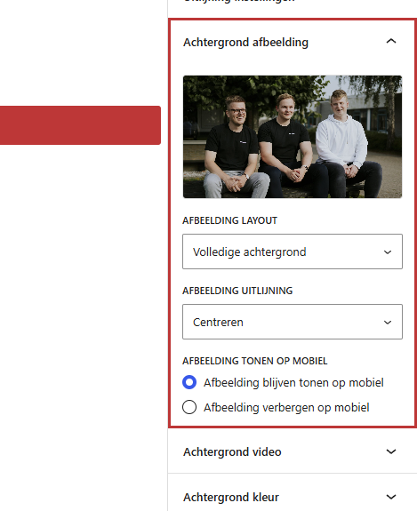
- Choose how the photo is positioned behind your text under Image layout.
- Overlay and gradient use the Background color of the section.
- Use a photo that is about 1920 pixels wide and choose a dark section color for white text.
What do you need?
- A landscape photo of about 1920 pixels wide, in JPG or WebP format, preferably smaller than 300 KB. Your website uses one fixed file for a background, even on a phone. A file that is too large makes your page slow. See uploading images in the correct format.
- A photo where the main subject is in the center: at the edges, something may be cut off on smaller screens.
Step 1: Open Background image and choose a photo
- Select the section (click on the edge, or choose Section in the list view).
- Open the panel Background image on the right.
- Click on Select image and choose a photo from the media library, or upload a new one.
The photo is now behind your section. With Change you can choose another photo, and with Remove you can delete it.
Nog geen website op leflite?
Wij bouwen hem samen met jou. Daarna pas je alles zelf aan, precies zoals in dit artikel.
- Online binnen een week
- Hosting, SSL en back-ups inbegrepen
- Vanaf €49,95 per maand
Step 2: Choose the Image layout
Once a photo is chosen, the dropdown list Image layout appears. Wherever there is a color over the photo, that is the Background color of the section.
Full background
The photo fills the entire section, without a layer over it. This is the default. Nice for a calm photo, but text is often hard to read on it.
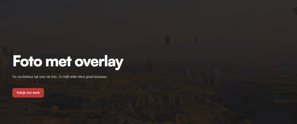
Full background + Overlay
A dark layer is over the photo, almost opaque. The photo still shines through. This gives the best readable text.
Full background + Left (50%) or Right (50%) Overlay
A light, dark layer is over the left or right half. Place your text on that side. This layer is always black, not the section color. On mobile, the layer covers the entire width.
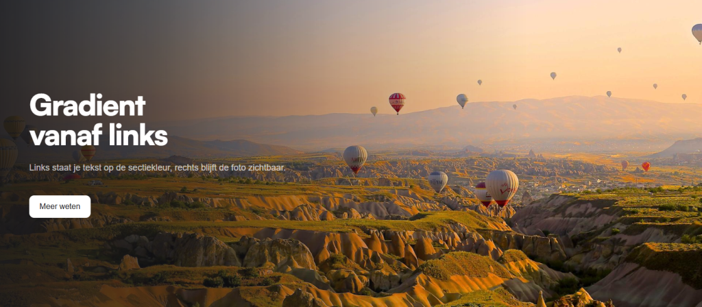
Full background + Gradient from left, right, top, or bottom
The section color fades from one edge to transparent. On that side, your text is in color, while the photo remains clearly visible on the other side. Combine from above with text at the top and from below with text at the bottom (see step 3 and aligning columns).
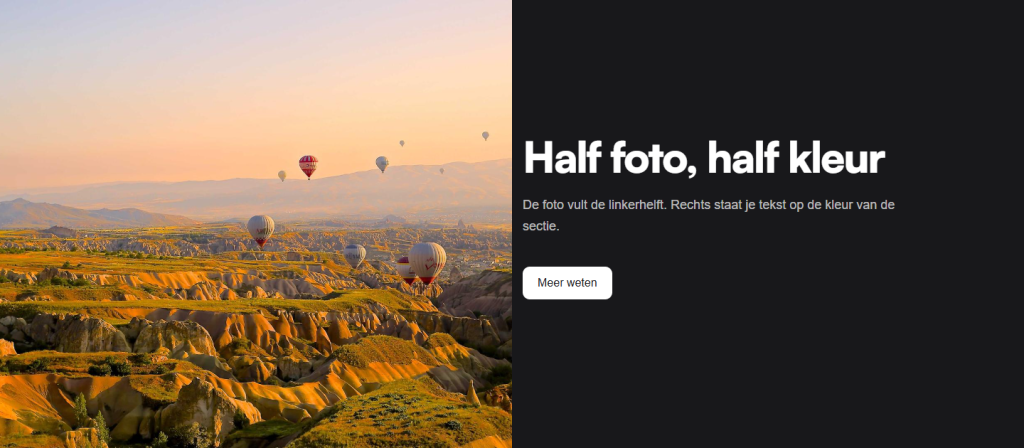
50% background + 50% color overlay (and vice versa)
The photo fills one half of the section, while the other half has the section color. In 50% background + 50% color overlay the photo is on the left; in 50% color overlay + 50% background it is on the right. Place your text in a column on the color side, for example, an empty column of 6 and a text column of 6. On mobile, the photo appears below the text, covering the full width.
No background
With No background the chosen photo remains, but it is not displayed. Handy for testing without losing the photo.
Step 3: Image alignment
Is the most important part of your photo cut off? With Image alignment you determine which part remains visible when the photo is cropped: Center (default), Top or Bottom. Choose Top for a photo with a face at the top.
Step 4: Show image on mobile
In Show image on mobile you choose Keep image visible on mobile or Hide image on mobile. If you hide it, mobile visitors will only see the section color. The photo will still load, so it won’t make your page faster on mobile.
Tip: choose a dark section color. The text color corresponds to the section color, even over a photo. A white section with a photo will therefore have black text on your photo. Choose for white text Black or another dark color. A dark color also prevents the section from flashing white while the photo loads. See choosing a background color.
Having trouble?
- Your text is black on the photo: the section is white. Choose a dark Background color.
- The dropdown list Image layout is missing: you haven’t chosen a photo yet. It will only appear after Select image.
- The photo is not visible: is the layout set to No background? Then choose a different layout.
- An important part of the photo is cut off: adjust the Image alignment, or give the section a different height (adjust height and spacing).
- The page loads slowly: the photo is too large. Reduce it to about 1920 pixels wide. Also read why your website is slow.
- You want moving images: use a video as a background.
Frequently asked questions
The text color corresponds to the section color. Choose a dark section color for white text.
About 1920 pixels wide, in JPG or WebP format, and preferably under 300 KB.
Share this article
Robert Oosterloo
Robert Oosterloo is eigenaar en UX/UI-designer van Lef Creative in Kollum. Hij ontwerpt websites, webshops en software voor ondernemers in Noord-Nederland.
Read also
More space between blocks
Tabs with Section tabs
Automatically display subpages as tiles






Want a website like this?
Here you can read how easy it is to maintain a leflite site yourself. Want one too? We will think along with you, no strings attached.
Prefer direct contact? Call Robert at 06 35 66 47 73 or send a WhatsApp.