
How do I create a photo gallery (grid, mosaic, or masonry)?

Robert Oosterloo
Updated on · 4 min read
With the block Gallery, you can neatly display a series of photos. When a visitor clicks on a photo, it opens large in a lightbox, where they can browse through all the photos. You can choose from three views: Grid, Mosaic, and Masonry.
In short
- Add the block Gallery in a column and select your photos in Gallery.
- In Photos per row, you can choose 1, 2, 3, 4, or 6.
- Display: Grid (default), Mosaic, or Masonry.
- With Maximum number of photos displayed, you show a random selection.
- A click opens the photo large, unless you have given the photo a link.
Nog geen website op leflite?
Wij bouwen hem samen met jou. Daarna pas je alles zelf aan, precies zoals in dit artikel.
- Online binnen een week
- Hosting, SSL en back-ups inbegrepen
- Vanaf €49,95 per maand
Step 1: Add the Gallery block
Click on the plus sign in a column, search for gallery, and choose the Gallery block. Usually, you place a gallery in a section with one wide column.
Step 2: Choose or upload the photos
Click on the button in the Gallery field to add images. Select multiple photos at once by holding down Ctrl (Windows) or Cmd (Mac), or upload new ones. You can adjust the order by dragging the photos.
Step 3: Choose the number of Photos per row
In Photos per row, you choose 1, 2, 3, 4 (default) or 6. On a tablet or phone, it will automatically show fewer columns.
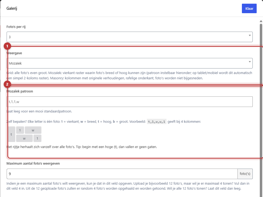
Step 4: Choose the Display
Grid
Grid (default) displays all photos equally sized in a grid. Calm and clear, ideal if your photos have the same aspect ratio.
Mosaic (and your own pattern)
Mosaic creates a square grid where some photos are wide or tall. This gives a playful, magazine-like appearance. Leave Mosaic pattern empty for the default pattern. Want to define it yourself? Each letter represents one photo:
- 1 = square
- w = wide (two boxes next to each other)
- t = tall (two boxes on top of each other)
- b = large (both wide and tall)
Separate the letters with commas, for example t,1,w,w,1. The sequence will repeat across all photos. Start with a tall photo (t), so there are no gaps. On tablet and phone, a mosaic automatically becomes a simple grid of two columns.

Masonry
Masonry places your photos in columns with their own aspect ratio: nothing gets cropped. The bottom is therefore ragged, like on Pinterest. Choose masonry if you have both portrait and landscape photos mixed together: in a grid, that quickly looks messy.

Tip: with Photos per row set to 1, the display will always be a grid. Mosaic and masonry require at least two columns.
Maximum number of photos to display
Do you have many photos but only want to show a few? Enter a number in Maximum number of photos to display. For example, if you upload 12 photos and enter 4, the gallery will randomly select 4 photos from the 12. Leave the field empty to display all photos.
Note: the selection is random. Visitors will not always see the same photos, and you cannot choose which photo is always at the front. If your website uses a cache, the same selection may remain for a while.
Preview image size
In Preview image size, choose which version of the photo appears in the gallery. For a gallery with 3 or 4 photos per row, Medium large (768 pixels) is often sufficient. The lightbox always displays the full photo.
Title and captions in the lightbox
Enable Show title and captions, then the lightbox will show the Title and the Alternative text from the media library under the enlarged photo. So fill those in properly first, see filling in a good alt text.
Do you want a photo to not open the lightbox but link to another page? You set that in the photo itself: see making a photo clickable in the gallery.
Prefer photos that come up one after the other? Then use the image slider. For a row of logos, see a row with logos from customers or partners.
Having trouble?
- The photos keep changing. You have filled in Maximum number of photos displayed. Clear the field to show all photos.
- There are gaps in my mosaic. Start the pattern with a t, or leave Mosaic pattern empty for the default pattern.
- My mosaic is a regular grid on mobile. That’s correct: on tablet and phone, it automatically becomes two columns.
- A photo does not open a lightbox. That photo has a link in the media library. Remove the link if you want the lightbox.
- The gallery loads slowly. Choose a smaller Preview image size and upload photos of a maximum of 1200 pixels, see uploading images in the correct format.
Can’t figure it out? Contact us.
Frequently asked questions
You have set a maximum number of photos. Then the gallery randomly selects each time.
Masonry. It displays each photo in its own ratio, without cropping.
Share this article
Robert Oosterloo
Robert Oosterloo is eigenaar en UX/UI-designer van Lef Creative in Kollum. Hij ontwerpt websites, webshops en software voor ondernemers in Noord-Nederland.
Read also
Setting up a slider
A video as a background
A photo as the background of a section






Want a website like this?
Here you can read how easy it is to maintain a leflite site yourself. Want one too? We will think along with you, no strings attached.
Prefer direct contact? Call Robert at 06 35 66 47 73 or send a WhatsApp.