
A button with link, size, color, and icon, and multiple buttons next to each other.

Robert Oosterloo
Updated on · 5 min read
A button allows your visitor to take the next step: contact you, request a quote, or read more. With the block Buttons, you can place one or more buttons on your page, with a link, a color from your branding, and optionally an icon.
In short
- Add the block Buttons in a column.
- Choose the Alignment: Left, Center, or Right.
- Click on Add new button and fill in the link and text under Button.
- Choose the Button type and the Color.
- Select an icon at Icon, and the position at Icon position.
Nog geen website op leflite?
Wij bouwen hem samen met jou. Daarna pas je alles zelf aan, precies zoals in dit artikel.
- Online binnen een week
- Hosting, SSL en back-ups inbegrepen
- Vanaf €49,95 per maand
What do you need?
- A column where the button should go, for example, below a text.
- The page the button should link to. It must already exist; otherwise, you cannot select it.
Step 1: Add the Buttons block
Click on the + (Add block), type ‘button’ and choose Buttons. The editing window will open. Place the block directly under the text that the button belongs to.
Step 2: Choose the alignment
In Alignment, choose Left, Center, or Right. If your text is centered, also choose Center for the button. The alignment applies to all buttons in the block.
Step 3: Add a button and fill in the link
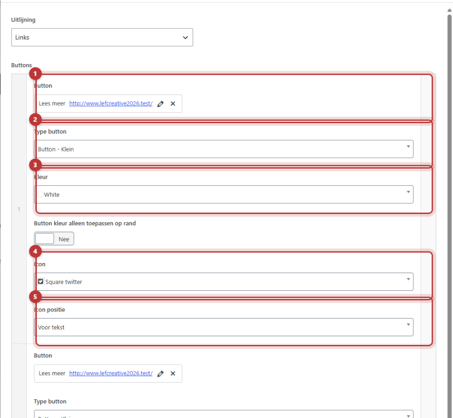
Under Buttons, there is a list where each line is a button. Click on Add new button for a new button. Then click on Button and select Select link. In the link window:
- Type part of the page name and choose the page, or paste a full web address.
- Fill in the button text with the text of the button, for example, ‘Schedule a conversation’.
- Click on Add link.
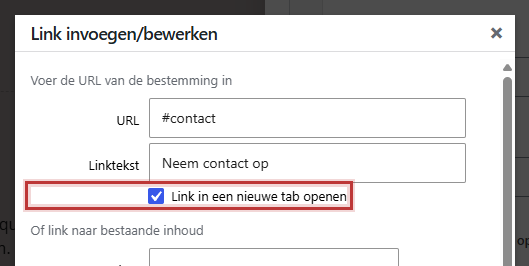
Open in a new tab
In the link window, there is a checkbox to open the link in a new tab. Use that only for links to another website. Links to your own pages should open in the same tab.
Step 4: Choose the type
In Button type, you determine the size:
- Button – Small: for a button that should not draw attention.
- Button – Medium: the standard. Use this for most buttons.
- Button – Full width: the button fills the entire column. Handy in a narrow column or in a card.

Step 5: Choose a color
In Color, you see the colors from your branding, with a colored square in front. If you choose nothing, the button will get your primary color. Always use the same color for your main button so that visitors recognize it. A second button next to it gets a calmer color.
A button with only a border: Transparent
Choose the color Transparent for a button without fill, with only a border. How the text of such a button looks depends on your branding. After saving, check if the text is readable against the background of your section.
Step 6: An icon before or after the text
In Icon, choose an icon, such as an arrow or a phone. Type an English name in the selection list, like ‘arrow’ or ‘phone’. In Icon position, choose Before text or After text. An arrow after the text invites clicking.

Multiple buttons next to each other
Click again on Add new button for a second button in the same block. The buttons will be placed next to each other; if there is not enough space, they will stack vertically. You can change the order by dragging a row. Keep it to two buttons: one prominent and one subtle.
A button that opens a pop-up or jumps to a section
- To a section on the same page: give the section an ID and use a # with that ID as the link, for example
#contact. See linking to a place further down the page. - Opening a pop-up: use the link
#lef-popup-followed by the number of the pop-up. See creating a pop-up. - Calling or emailing: use the link
tel:ormailto:followed by your number or address.
A button in the menu at the top of your site is set elsewhere. See a button or icon in the menu.
Note: do not place a shortcode, such as the one for your phone number, in the text of a button. It creates its own link, and a link within a link does not work well.
Is it not working?
- The button is not on the website. A button without a link will not be displayed. Fill in a link at Button.
- You cannot find the page in the link window. The page has not been published yet, or you are searching under a different name. Otherwise, paste the full web address.
- The text on the button is poorly readable. Choose a different color, or place the button in a section with a different background.
- The button does not jump to the section. Check if the ID for the section exactly matches what follows the #.
- The buttons are not next to each other. Are they in two separate blocks? Place them as two rows in one Buttons block.
- Still not working? Contact us.
You can find more blocks in all blocks in a row. You can read about links in running text in adding a link.
Frequently Asked Questions
Choose the color Transparent. You will then get a button with only a border. Check if the text is clearly readable.
Share this article
Robert Oosterloo
Robert Oosterloo is eigenaar en UX/UI-designer van Lef Creative in Kollum. Hij ontwerpt websites, webshops en software voor ondernemers in Noord-Nederland.
Read also
Automatically display posts or pages
Setting up a slider
Using the Text block






Want a website like this?
Here you can read how easy it is to maintain a leflite site yourself. Want one too? We will think along with you, no strings attached.
Prefer direct contact? Call Robert at 06 35 66 47 73 or send a WhatsApp.