
How do I create a card with an image, text, and a button?

Robert Oosterloo
Updated on · 4 min read
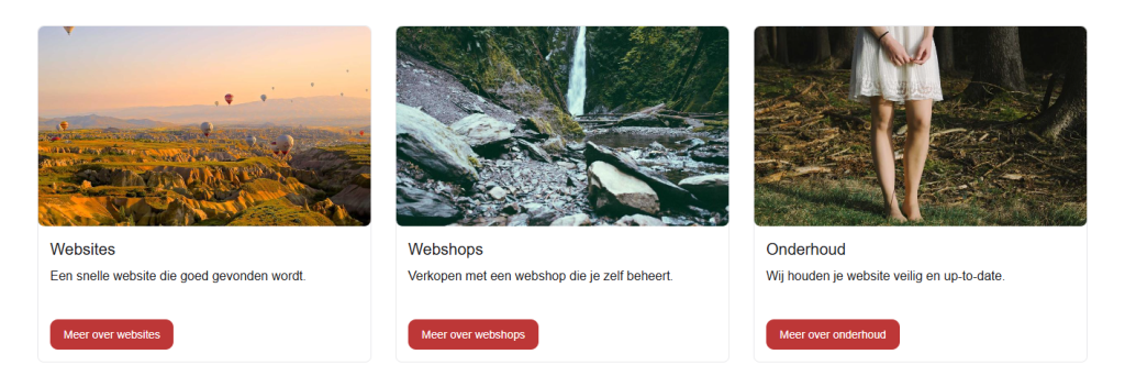
A card is a tile with an image, a title, a short text, and a button. Three cards side by side are ideal for showcasing your services, actions, or projects. With the blocks Card normal and Card simple, you can create them yourself, with exactly the text you want.
In short
- Create a section with columns, for example, three side by side.
- Add in each column Card normal (with image) or Card simple (without) .
- Fill in Image, Title, and Intro text, and add a button under Buttons.
- No button needed? Turn on Hide read more button.
- The entire card is clickable: a click goes to the link of the first button.
Nog geen website op leflite?
Wij bouwen hem samen met jou. Daarna pas je alles zelf aan, precies zoals in dit artikel.
- Online binnen een week
- Hosting, SSL en back-ups inbegrepen
- Vanaf €49,95 per maand
Card normal or Card simple?
- Card normal: with Image at the top and an optional Date (optional). For services, projects, or news with a photo.
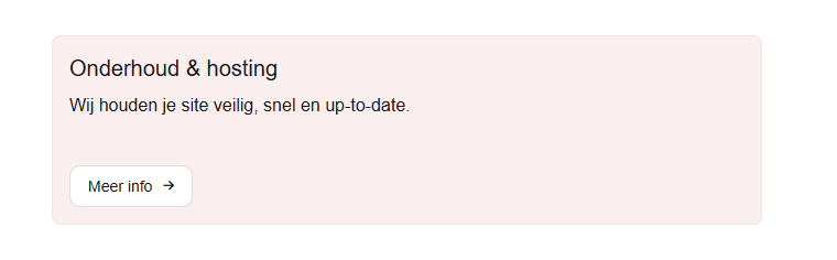
- Card simple: without an image and date. For a short tile with only text and a button, possibly with a background color.
You can find both blocks in the block inserter in the group Cards.
Step 1: Prepare columns
Create a section with as many columns as you want cards, for example, three columns of 33%. See adding a section and dividing into columns.
Step 2: Add a card to each column
Click on the + (Add block) in the first column, type ‘card’ and choose Card normal or Card simple. The editing window will open.
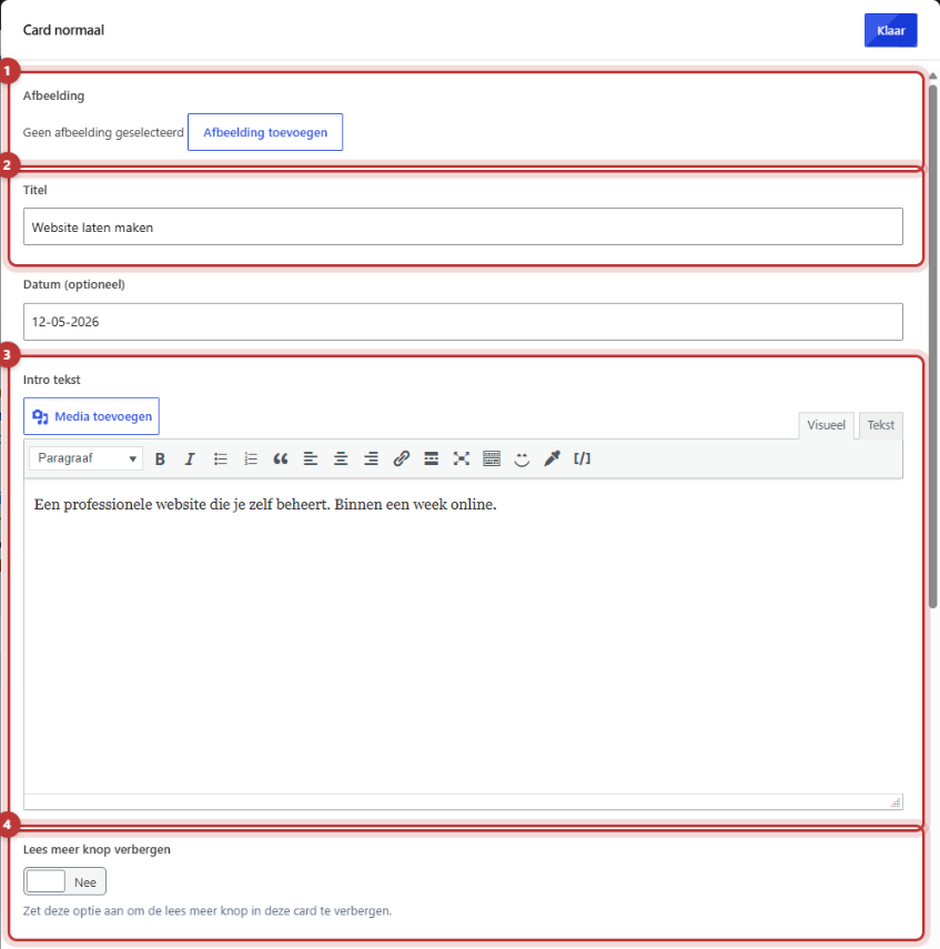
Step 3: Fill in the fields
Image, Title, Date, Intro text
- Image: click on Add image and choose or upload a photo. Use images in the same ratio for all cards in a row, so they remain the same height. See images in the correct format.
- Title: short and clear, for example, the name of the service.
- Date (optional): only if the date matters, such as for an event.
- Intro text: one or two sentences. This field works like the Text block.
Buttons or the Read more button
In Buttons, click on Add new button and fill in the link and text, just like in the Buttons block. See adding a button.
Do you not want a button in the card? Then turn on Hide read more button. Always do that if you do not add your own button; otherwise, a ‘Read more’ button will appear that does not go to the right page.
Step 4: Choose the background color
In Color, choose a background color for the card from your brand style. If you leave it empty, the card will take on the default style of your website. A colored card stands out among white cards; use that for your most important offer.
Done with the first card? Click on Done. Select the column and choose Duplicate from the three dots. Only adjust the image, title, text, and link in the copy. This way, all cards are built the same. See copying a block or column.
The entire card is clickable
A visitor does not need to click precisely on the button: a click anywhere on the card opens the link of the first button. Therefore, place the most important link as the first button. How to do that for a column, you can read in making a column or card fully clickable.
Even-height cards
If your cards have different amounts of text, they will be uneven in height. Make them the same height with the section: select the section, open Alignment settings and choose the option Stretch under Column alignment. More about that in aligning columns and making them even height.
Cards with posts or pages? Use Highlighting
Do you want cards of your latest blog posts, or of all your service pages, that update automatically? Then do not create them manually, but use the Highlighting block. See automatically displaying posts or pages. Do you want to display an entire column with different blocks in it as a card? See a column as a card.
Having trouble?
- There is a Read more button that goes nowhere. Add your own button under Buttons, or turn on Hide read more button.
- The cards are not the same height. Set the section to Stretch and use images in the same ratio.
- There is a gray area instead of a photo. In Card normal, no Image has been chosen. Choose one, or use Card simple.
- A click on the card goes to the wrong page. The card follows the first button. Place the correct link as the first.
- Can’t figure it out? Contact us.
Frequently asked questions
Without your own button, the card automatically shows Read more. Turn on Hide read more button or add a button.
Share this article
Robert Oosterloo
Robert Oosterloo is eigenaar en UX/UI-designer van Lef Creative in Kollum. Hij ontwerpt websites, webshops en software voor ondernemers in Noord-Nederland.
Read also
Automatically display posts or pages
Setting up a slider
Using the Text block






Want a website like this?
Here you can read how easy it is to maintain a leflite site yourself. Want one too? We will think along with you, no strings attached.
Prefer direct contact? Call Robert at 06 35 66 47 73 or send a WhatsApp.